There’s been a lot of thinking about flag design lately: What are the elements of a good flag? What’s wrong with bad flags? How great a really great flag can be, and how sad and useless a bad flag is.
Much of the current thinking about flag design traces back to celebrity audio person and design aficionado Roman Mars, who recently introduced us to the very geeky subculture of vexillology (the study of the history, symbolism, and usage of flags) in a very geeky episode of his 99% Invisible podcast. You can check it out here.
The key lesson from Roman’s crash-course in Vexillology 101 is that good flag design follows five basic rules:
1. Keep it simple
2. Use meaningful symbolism
3. Use two to three basic colors
4. No lettering or seals of any kind
5. Be distinctive
That kicked off a national conversation about flag design; a conversation that grew even more urgent when Roman Mars was invited to give a TED Talk on the subject:
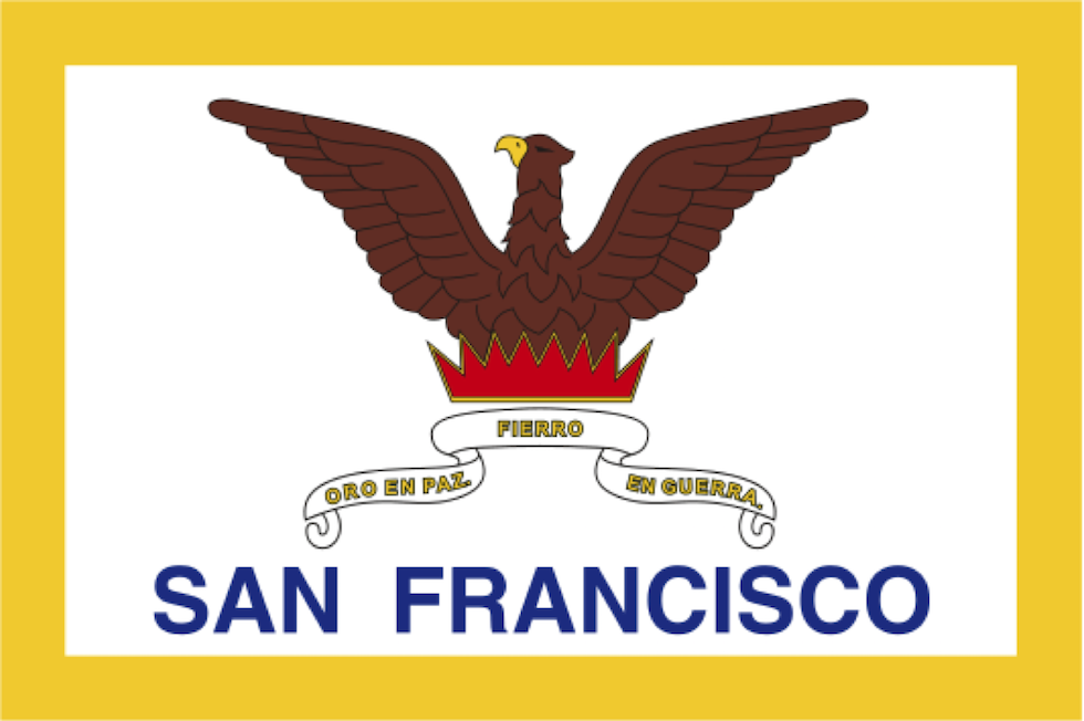
The crux of his TED Talk was that the flags of American cities are generally rather terrible, and San Francisco is a clear case in point. Very few people are familiar with San Francisco’s flag, because San Francisco’s flag is a hot steaming mess that breaks all the rules of vexillological good taste. It looks like this:
In the spirit of civic improvement, Roman Mars has kicked off a new effort to redesign San Francisco’s flag. But in the meantime, that got your Bernalwood editor thinking: What about a flag for Bernal Heights? Don’t we deserve a flag too?
Of course we do.
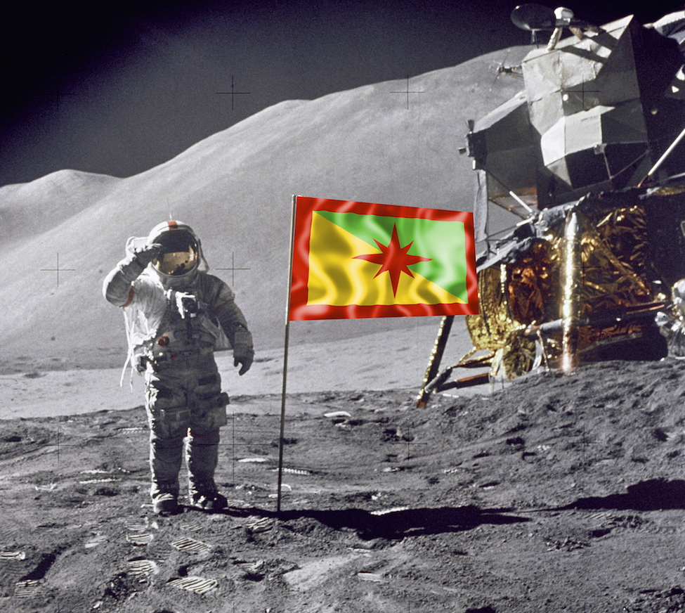
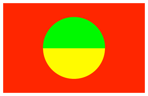
So after internalizing the design rules recommended by vexillologists, I took the liberty of developing a flag for Bernal Heights. I hope you might entertain the idea of rallying around it. Fellow citizens, I propose that all Bernalese should live in peace under this banner, the (Proposed) Great Flag of the Dominion of Bernal Heights:
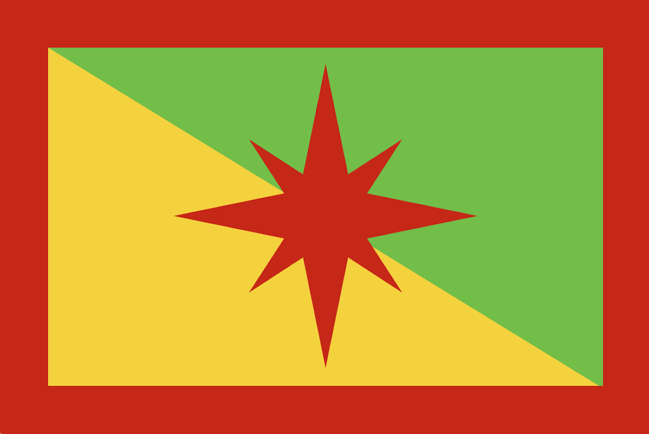
Rather sporty, eh? Dynamic! Bold! Distinctive! Let’s walk through its symbolism:
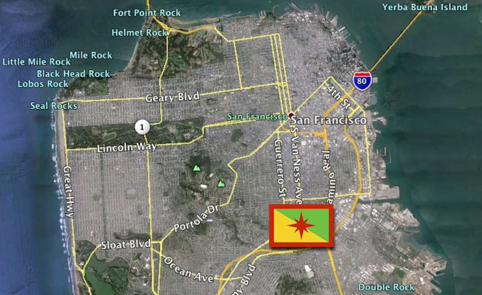
- The diagonal fields of green and yellow represent the two annual phases of Bernal Hill: green (winter wet) and golden yellow (summer dry).
- The four sides of the red border represent the four roads that define the boundaries of our Bernal territory: I-280, San Jose Avenue, Cesar Chavez Boulevard, and US 101.
- The star at the center is of course Bernal Hill, shown as a compass rose to represent the 360-degree views of San Francisco visible from the summit. The red color symbolizes both the beloved chert which stabilizes us, and the long tradition of social activism which is an important part of our neighborhood history.
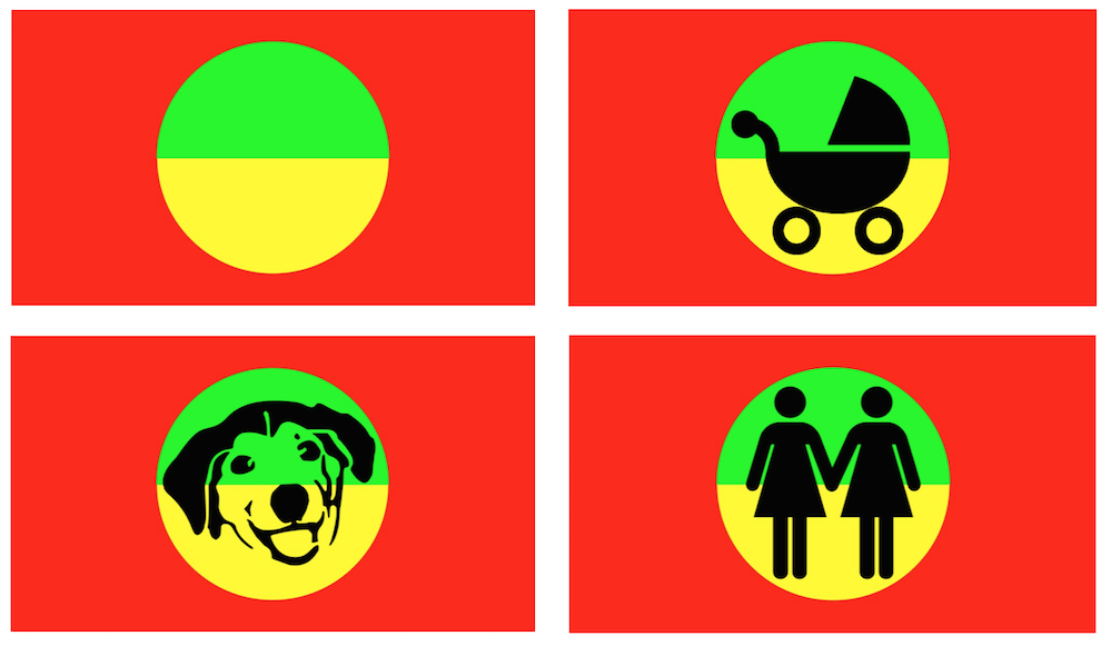
That’s my proposal. I think it’s not too shabby, at least as a first stab at a flag for Bernal Heights. Plus, it would do the trick if you wanted to quietly represent Bernal in your workplace or favorite coffee shop:
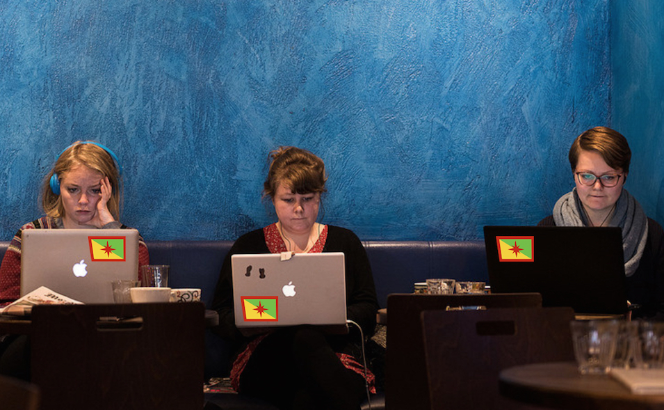
This design travels well too. No matter where you go, or whatever distant lands you conquer, you can take your Bernal Heights pride with you:
That said, there are some other designs to consider. Bernalwood’s Cub Reporter rose to the challenge, beginning with some small-scale drawings (which are recommended as a starting place to simulate the view of a flag from a distance):
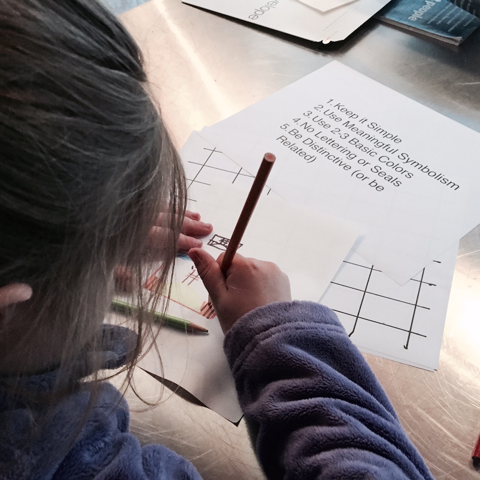
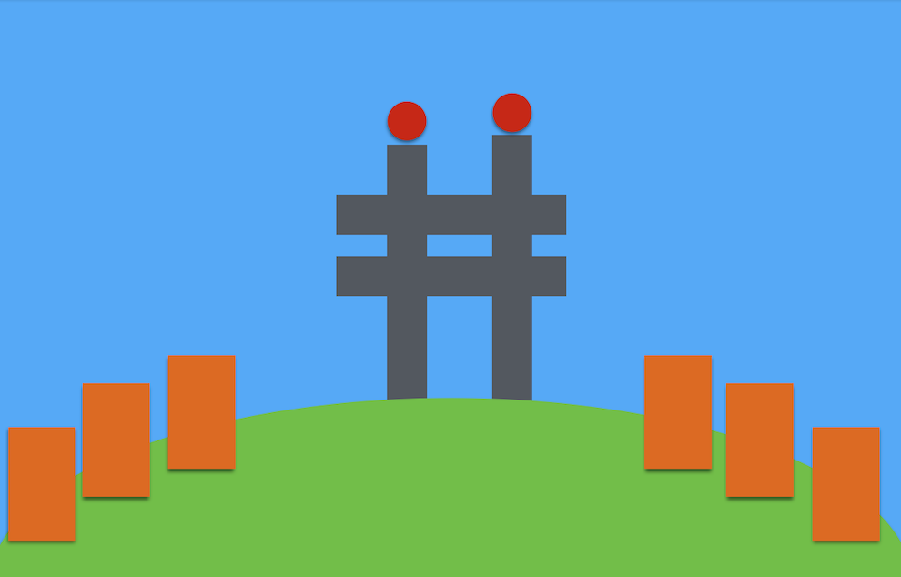
Bernalwood’s Cub Reporter developed two designs. The first is a simplified view of Bernal Hill and Sutrito Tower, with tiny houses nestled along the slopes:
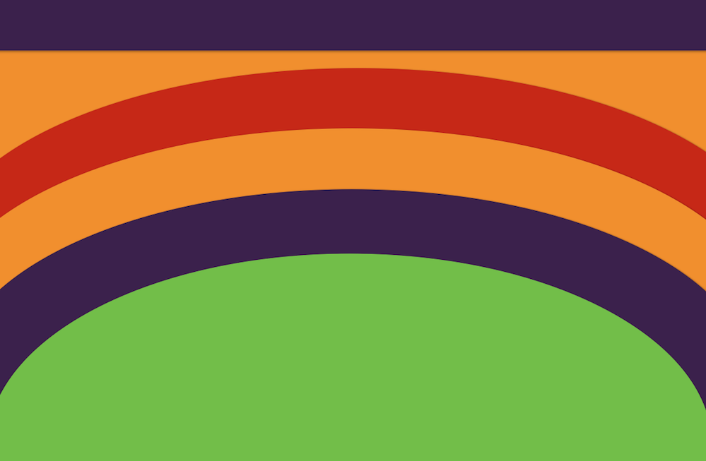
Her second concept is more bold. It’s a colorful interpretation of a perspective she loves; the view looking toward the sunset as you stroll west along the north side of Bernal Heights Boulevard toward Folsom in the evening:
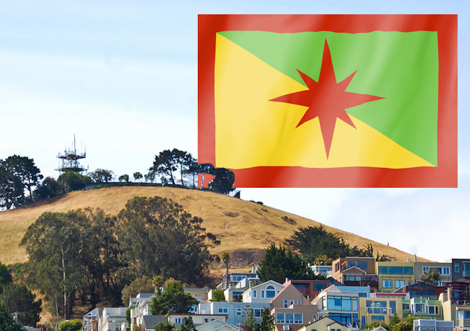
Always game for a goofy graphic design problem, Burrito Justice, rebel spokesblogger for the La Lenguan separatists, also rallied to embrace the Bernal flag design challenge. Picking up on some of the themes in my design, he came up with a clever interactive concept:

The symbolic logic? Burrito Justice explains:
Green hill, yellow hill, chert background… You turn the flag over depending on the season.
Nice! To bring some further innovation to the idea, Burrito Justice then proposed the world’s first animated GIF flag:
Burrito Justice calls it “a flag for all seasons.”
Your Bernalwood editor called it “hard to sew.”
Burrito Justice explained, “Yeah but imagine the sales, people would need a new one every two weeks!” (Which is actually rather diabolical and brilliant.)
But of course, he couldn’t stop there. Next, Burrito Justice created a few more versions of his flag to celebrate Bernal’s most iconic residents:
Sigh.
Bet hey, maybe you have a better idea for a Bernal flag?
If so, send it to us here at the Bernalwood Office of Vexillological Research or drop it in the comments, and we’ll share any additional ideas for Bernal Heights flags with the Citizens of Bernalwood soon.
IMAGES: Bernalwood Office of Vexillological Research

Gotta go with the Cub Reporter’s first effort — all of the others left out the sky, which is a big part of the Bernal visual.
Sorry, but that’s about as unimaginative as it gets. We need something better than that pathetic design.
Bring it on!
Hmmm.
I love Todd’s design. I’d like to fly one from my house. 🙂
I like Todd’s flag with the star – it looks great!
I really like the cub reporter’s arch design, reminds me of the rainbows, view, and sky.
I don’t see how those colors or a start fits into Bernal. I don’t associate Bernal with a star. Maybe a hill, or a sunset, but not a star. Also, those colors are a little too Ethiopian or Kurdish for me. What about Red, Green & Yellow screams Bernal? Maybe blue (for the skyline) and yellow (for the “grass”)
Good first effort though
the tattoo goes on one’s right shoulder
As a retired design professor, may I make some suggestions and comments? And I do apologize for my earlier negative remarks about the proposal. A flag takes on a life of its own after it’s been designed, and becomes more or less permanent. Therefore we don’t want something amateurish. One problem of amateurs is that they usually think in symmetrical terms, which produce dull results. One approach would be to hold a competition and then take a vote, but a competition among design students who have some serious training. Another direction would be to go to probably the best known Bernal artist of the moment, and one who has proved his ability, and that would be Amos Goldbaum. His mural is really quite a wonderful Bernal Heights addition, which avoids all the usual cliches. Here’s his address: AmosGoldbaum.com.
Precisely. More ideas are welcome. Tell your designey friends: Bernal Heights needs a flag, and so far only hacks and 7 year olds are designing them. Have them send us more design concepts.
As for Amos, we know him and celebrate him often. He would rock this.
You can use an image of mine inside your flag.
Your flag needs some blue.
Let’s get A section of Arch William’s library mural inside your flag.
Your efforts Bernalwood are to be admired!
Inclusiveness must be depicted !
Good luck!
I am a retired Art Professor too and I would not recommend ! I think you need time for this idea but I like a piece of art by a young cub very much! It would be inspirational.
I agree with Toby and Tom: this is an important design that must be mulled over. It will be around a long time IF it is a good design.
For people who want to design their own, this is a good web site to practice flag design
http://flag-designer.appspot.com/
I like it, boring symmetry and all.
I, and many of my neighbors, believe that all of the attention in the name of Bernal isn’t making things better in our hood. Its responsible for theft, burglaries, break-ins, car jacking. Not to mention increased prices, traffic, and lack of parking all in the name of the increased attention and spotlight on money and fabulousness in Bernal.
Really? There were burglaries, robberies, car thefts, and various petty crimes long before Bernalwood existed.
Yes, car-jacking is rampant in Bernal these days.
Said no-one who wasn’t trying to be a hyperbolic troll.
Your comment, though true, is not relevant to the issue I am raising. There has been a marked increase of very aggressive, bold acts against the population of Bernal. Door jambs being pried open on a weekday morning and entire houses emptied, cars left outside without a club lock for ten minutes in between coming home from school and getting gear for a sports event, stolen in the space of a few minutes (and not fancy cars). I always left a spare key under the flowerpot. Now I am advised strongly against that. The coolness, the hipness, the money-its like flashing a neon sign- rip us off, there is plenty here. There is privilege here. A white newcomer has an issue with a neighborhood kid, over some minor parking dilemma, their response is to call the cops. Really? Smart move to get the law involved over 10 ft of curb and a Latino youth in a hoodie. These days, that kind of unnecessary over-reaction (with a dash of racist fear) could have changed the course of that young man’s life forever; maybe even ended it. Someone already died on our hill not too long ago. Oh, right, people died long before Bernalwood existed.
Bernal was cool and hip and fun without a blog or a flag or a mural to remind us. I like Bernalwood. I just wonder if they ought to consider what kind of effect their content can sometimes provoke.
“I like Bernalwood. I just wonder if they ought to consider what kind of effect their content can sometimes provoke.”
I find Bernalwood an excellent and entertaining source of neighborhood news, but I’m not sure it’s really attracting the level of traffic and influence that you seem to imply it is. I suspect its readership beyond the borders of this neighborhood, while nonzero, is pretty small.
Agreed. We should tell people that we detest the current Bernal, what with its “money and fabulousness”. Together, through negativity, we can make things (theft, burglaries, break-ins, car jacking, increased prices, traffic, and parking) better in our hood. 🙂
Check the stats. Intelligence and awareness trump negativity and stupidity.
Youre a dump truck. Julie is right
@ Julie G: I’ve been a devoted Bernalwood reader since Bernalwood began, and out of the hundreds of posts and thousands of comments, your comments on this page are the most ludicrous and irresponsible that I’ve ever seen.
You think that a blog is provoking theft, burglaries, break-ins, car jacking, racism, and death? Seriously? Did Bernalwood inspire ISIS too? Did Putin invade Ukraine after reading Bernalwood?
Bernalwood has been nothing but a tremendous positive for Bernal Heights. I cannot say the same for your misplaced accusations and negativity.
Personally, I’d somehow integrate a simplified-but-sufficiently-distinctive outline of the hill instead of a central star or circle. I’ll leave it to someone of greater artistic skill to ponder that further.
I like the rasta vibe of the flag- we are pretty chill up her in bernal that’s for sure, our rally cry be http://www.youtube.com/watch?v=JmcA9LIIXWw&sns=em – you can thank me for the earworm for the day 🙂
Why not tip our hat to our Bernal tradition? I always thought having folks with a secret Bernal cattle brand tattoo would have been fun. Perhaps that could be our distinguishing mark?
https://bernalwood.wordpress.com/2011/02/09/our-secret-sign-the-bernal-familys-cattle-brand/
I selected more simplified colors myself, orange for our brilliant sunshine. Although green would be lovely too.
Here is what I mean…
Neighbor Brian
Apparently, I don’t know how to embed a image in the comments. Here is a link

I like it, Brian. It’s kind of arcane, and involves history and simplicity. People would ask what it meant, and that would be an opportunity for us to tell them.
That’s great, Brian!
BRILLIANT!
Brian this is so great. Is there a symbolic logic for the orange and white?
This one gets my vote! I like the idea of your design, Todd, but this one jumps of the screen!
🙂 I like the Game of Thrones vibe. However, I keep seeing it as a clever F.U.
No offense taken! My designs were intended to be a vehicle to get us to this level of wonderfulness.
An evolution of Brian’s concept:
While we don’t know why the Bernal family chose this symbol, my seven year suggested that the ‘F’ might stand for ‘Family’. I would like to take a considerable amount of license to suggest that the other mark represents a hill. The combined mark would then represent ‘Hill Family’. My three year old would like to see some rainbows. He calls San Francisco the ‘Rainbow City’. I like rainbows too.
I like the symbolism and love the history, but it sort of reminds me of a Frat House logo. Especially, the updated blocky font.
Mysterioso!
Here is an alternate version with Green. Yellow felt too close to the San Francisco Flag. Light Blue was strong but not very on brand. What color is Bernal’s Brand?
And because it’s Friday let’s have a little Spectrum Loop. Stop on your favorite color!
http://rev9.net/BernalFlag/BernalBrandFlag-spectrumloop.mov
I’ve always felt that Bernal’s brand-color is green, but that’s just been my gut feeling.
The Spectrum Loop is further evidence of your genius. And turns out, sky blue looks pretty good too:
There is one she between Orange and Red that is quite nice, we could call it Bernal Sunrise.
A little suggestion for those who want to submit designs. Work up 10 designs. That’s right TEN. Then narrow it down to the three best, and submit those. Usually your first design will not be the best one–but if it is, that’s great. Actually, I really like the first “Bernal Cub” design, but the symmetry bothers me. The buildings swirl around Bernal in quirky street patterns–one of our best features, and that’s one of the reasons I lake Amos Goldbaum’s work so much. Another suggestion is to avoid “messages.” They are inevitably like Santa Claus posters left up all year.
Of what’s been presented, I also like Cub reporter’s first design. What’s the hill without the sky, and her colors are kinder than screaminggreenyellowred. Also, that red star looks just plain aggressive.
While I’d love to see more ideas, it would be a shame to see this turn into another bone of contention (aka the library mural). So lets keep it kind and friendly, folks.
Totally agree.
Hi Good Folks at the Bernalwood Office of Vexillological Research,
I have some questions that I didn’t see answered. Why do we need a flag?
What is the intent with a flag: Instant recognition to people not lucky enough to live here? Our undeniable Bernal coolness? Identify that we are distinct from other adjacent neighborhoods? Do they have flags? Isn’t our fabulousness already self-proclaimed like our namesake “Hollywood” ? Maybe not…
Have you considered other forms of cultural identifiers like rastacaps? What if we had Bernalcaps for Karl The Fog days? Or perhaps our own dessert like Bernal Chert Cake that could take on it’s own notoriety like the poorly copied Southern classic red velvet cake?
Just trying to expand on ways to identify our little pocket of Fabulousness here. 😀
You. You are officially in charge of Bernal Chert Cake design. That’s a great idea too. Photo or it didn’t happen; extra credit if you invite me over for a taste.
OMG – bernal chert cake could be a reincarnation of San Francisco’s famous “Blum’s Coffee Crunch Cake”. It is freaking FAAABULOUS. and looks kind of chert-y. And historical too!
http://baghdadbythebaysf.com/2013/05/blums-coffee-crunch-cake/#sthash.DKmFIdjU.ETIrnT7E.dpbs
When I look at Todd’s flag design I think “Thailand?”
The flag says nothing about Bernal Heights.
The centerpiece of any Bernal flag must be a red hill.
Needs a bear!
Wouldn’t an opossum be more appropriate, or a raccoon?
You’re crazy, the San Francisco flag is awesome. If it weren’t nearly identical to the SFPD emblem I’d get it tattooed.
Drawing a blank for a Bernal Flag right now… but symbolism for the La Legua autonomous zone is a no-brainer.
If there is going to be a star to represent hill views, there should be a second star to represent Holly Hill.
The red for the border roads makes some sense since those roads tend to appear red on google’s traffic maps.
Don’t forget about Rule #6 : Must be aesthetically sound.
The red star rasta versions are pretty fugly.
My only suggestion is to keep the politics out of it and make it about the friendliness of the neighborhood and its beauty. That will keep us closer and happier than a political slant to it. Thank you
There is an old flag design that’s associated with Bernal.
Yes! The days when a woman could Lean In…and defend her Second Amendment rights.
I’m gonna have to take a crack at this. Stay tuned…
Can’t wait.
I’ll throw this in! If folks like I’ll make some final polishes.
-Laura (Bernal resident and graphic designer)
https://scontent.fsjc1-1.fna.fbcdn.net/hphotos-xpt1/v/t1.0-9/10422499_10100635112936205_5190542571821608516_n.jpg?oh=f1d72f11c3884ca1a060602f30b651c5&oe=55FF6236
Love that!
Yay! Laura that’s really gorgeous.
Laura’s seems to accommodate all the concerns above: friendly colors, a hill, show sky, not political, neighborly … I give it a big YES.
That’s a very nice design.
Something to consider: When flown with the sky as a backdrop, that flag will disappear except for the yellow portions.
I like it too. This has just started, and already there are some good ideas and designs. Who knew?
I personally Love Todd’s first design. Wonderful idea, I enjoy flags a great deal. My second choice would be the cub’s design number one. I would proudly fly either one.
It occurred to me this morning that it wouldn’t necessarily have to be a traditionally shaped flag. It could be more like a banner in a long triangular shape like some nations used in Medieval times. It cold even take less traditional shapes. As to the question of why have a flag at all–to me it’s just old fashioned neighborhood pride.
Because it would be fun?
+1
Only bit of design guidance I can contribute: Ask any kitemaker, sailmaker or outdoor banner maker and they will tell you the two worst colors against the sky are sky blue and green, especially green. Flags with those colors risk being unappealing if they are meant to be flown outdoors. Try it for yourself. Colors shown to be attractive with the sky as a backdrop: red, white, black, gold, orange…
Above advice appreciated. If I could figure out how to attach a photo to this site, I’d post one of a brilliant banner with complex colors and design and a very creative shape made by a Seattle woman. That particular banner wouldn’t be appropriate for our Bernal branding, but it sure would expand consciousness about color and design. Can anyone tell me how to attach it?
/Users/thomaslibby/Desktop/sc00081cf6.jpg
Sorry, wordpress is a bit of a pain about this. The image needs to be hosted on the web somewhere, so that you can copy/paste a URL in the comments. Or you can send it to me (bernalwood@gmail) and I can add it here via an edit.
Tom, let’s see some of your designs too!
Bernal heights doesn’t need a flag. As a person who was raised in bernal heights I think it’s sad that many people continue to change a place that doesn’t need any more change. We have the San francisco flag and that’s enough. The fact that many people refer to bernal heights as bernalwood upsets most of the people that were lucky enough to be raised in bernal heights including myself. Just keep things simple, what do you really want a flag for?
Because it’s fun?
+1
Then draw one up and put it on the fridge.
I don’t think that anyone’s suggesting that flying a Bernal flag would be compulsory…
I like the incorporation of the international symbol for chaos. Brings back memories of the Odeon Bar.
I think your flag is great, and fun is so important! Wonderful piece. Thanks.
Since seeing this flag I have stolen 2 cars and burglarized several local homes. Help me! Furl your flag…
Pingback: Bernal Streets Offer Guidance in Confederate Flag Debate | Bernalwood