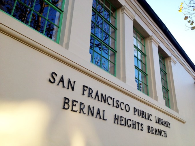
If you’re one of those people who spent the last decade or two wondering what the Bernal Height library would look like if it didn’t have a mural painted on its facade, you’re now in luck. The old mural was removed last month and the new mural will go up sometime in the months ahead. Yet for now — and for the first time since the early 1980s — the library is sans mural.
In a way, it’s a little disorienting; kind of like seeing Gene Simmons without his Kiss makeup. But unlike Gene Simmons, our library’s looks seem to get better and better with the passage of time.
PHOTOS: Telstar Logistics


Nice!
I prefer it this way.
Bring on the tramp stamp!
Your post is rude and disrespectful to the artists who spent a lot of time and thought into the new designs. This was not an easy process and instead of looking at the artwork and saying a snide remark think about the people that you are offending.
Heh heh, apparently you haven’t seen it Lanie.
Wow – The library is beautiful! Forget the new mural. Keep the library this way.
Finally, YES – just leave it. Now it looks classically stunning and your eyes draw inside to see the awesome ceiling!!
So boring. Can’t wait for the new mural to liven it up. A shame they scrubbed off the old one instead of restoring it, but better the new one than nothing, that’s for certain.
Leave it this way! What a beauty!
A tribute to the WPA who built it.
Leave it as it is! It’s beautiful-spare and clean.
It looks glorious!
Heck of a lot easier to cover over the impending tagging if left as is.
I love how beautiful it looks. Is there ANY chance that leaving the library unadorned might be reconsidered? What if enough people chimed in here? Its a classic beauty and a tribute to the WPA, indeed. I’m sure it will look nice with the mural, too, but I love the simplicity.
Agreed – It is so much easier to appreciate the architecture of the library without that awful 80’s mural or the “tramp stamp” mural in the pipeline. Is there a petition or something we can sign to keep the facade “as is”?
Don’t put up another crappy “artsy” mural. Leave the architecture alone. Most murals in SF are really really bad, by really really untalented so called “artists”.
Looks great….they finally finished it. A very subtle job, my congratulations to the muralists.
the building sans “artsy” mural is so elegant and classicallyimposing, really makes a statement. Can we get Terry Milne to intercede on behalf of this statekly edifice? please? i hope so.
Perfect the it looks now ! Why mess it up with a TACKY mural?
How elegant, let’s keep it beige and beautiful
I love this building. To me it is a memorial to the WPA program and to the men and women who created it. This is how it was designed and built and I think this is how it should remain. I’m an artist, who has painted murals, but this is one building that I think is much better without one.
It is beautiful and this look will sand the yet of time through the years. The old mural was faded and not that spectacular. If some insist on a mural make something fun on the backside where the playground is and leave the front facade in its classic look.
Meant to type “stand the test of time”
That’s a great idea – mural on park side, natural on facade. I do wonder if there is a way to get in a last minute postponement?
Love it, maybe it can have a few touches of color in the trim? But I TOTALLY agree, looks so much better without the mural! I vote for a fun, contemporary (Lower Haight style) mural on the back playground side, and simplicity on the front. I love it like this!
Pingback: Bernalwood 2012: The Year in Superlatives | Bernalwood