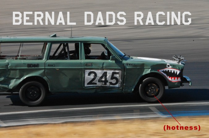
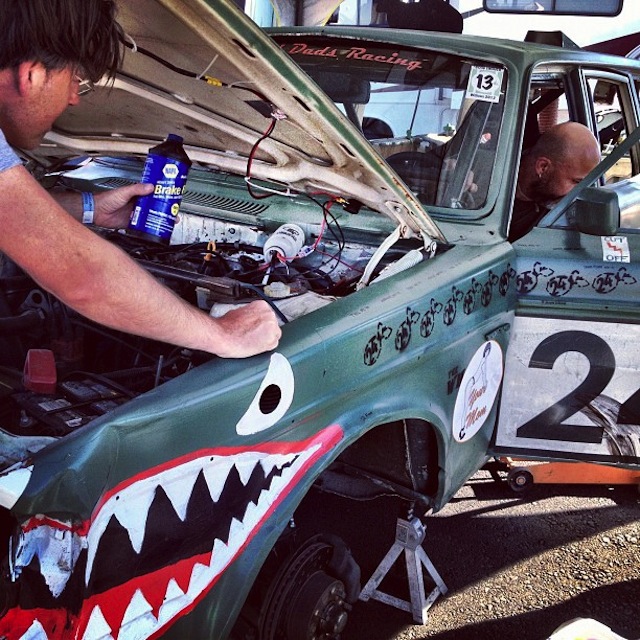
As you read this now, those grease-stained gearheads from the Bernal Dads Racing team are on their way to stylish Sonoma to prep for this weekend’s 24 Hours of LeMons at Sears Point Raceway.
The battle-hardened Dads plan to race their battle-scarred Volvo 240 station wagon — affectionately known as The Whale — for 17 long hours over two consecutive days on a winding high-speed road course. As my alter-ego Telstar Logistics put it last year:
Don’t let the appearance fool you though. The Whale is kind of like the Millennium Falcon; It may not look like much, but its got it where it counts. Sure, the body has taken a lot of hits during its impossibly long LeMons career. But after so many races and so much tinkering, “the car is properly sorted,” as one Bernal Dad put it.
Your Bernalwood editor will be embedded with the Bernal Dads (and The Whale) throughout the weekend, and if you’d like to cheer from the virtual grandstands, tune your Twitter dial to @bernaldadsracer. You can also check out the Car and Driver blog, where you’ll find photos and updates from trackside.
Wish the Bernal Dads luck, because frankly… they’ll need it.
PHOTOS: The Whale, by Telstar Logistics


Viva la balena blanca! Good luck, be nice to the judges, and look forward to the updates!
I just love the 245. sooo close to http://www.waste.org/front242/pictures/front242logo.gif …Is that Helvetica?
Looks more like Futura to me. Helvetica’s 2 is curvier off the lower left corner.
+1 for type commentary.
This is a service we are pleased to provide.
Good luck to Todd and the Dads this weekend!
The Volvo 240 is awesome. I’m not a car fan, but of all the cars in the world, that model is the one I like. That it has a whale face on it is awesome, but I always thought the best thing to put on the front of one of those is an exploding brick wall.
I’ll see if I can confirm which typeface was used for the numbers. They were printed by the late, lamented @Signs Printing.
@Signs’ Erik doesn’t have ready access to the files, but says:
“Absolutely not Helvetica, and it might be Futura but I wouldn’t bet on it.”
Century Gothic Bold, it is. Elegant as The Whale itself.
Century Gothic Bold
I love that 80% of the comments are about fonts.
Pingback: Ride Along with Bernal Dads Racing During 24 Hours of LeMons at Sears Point | Bernalwood