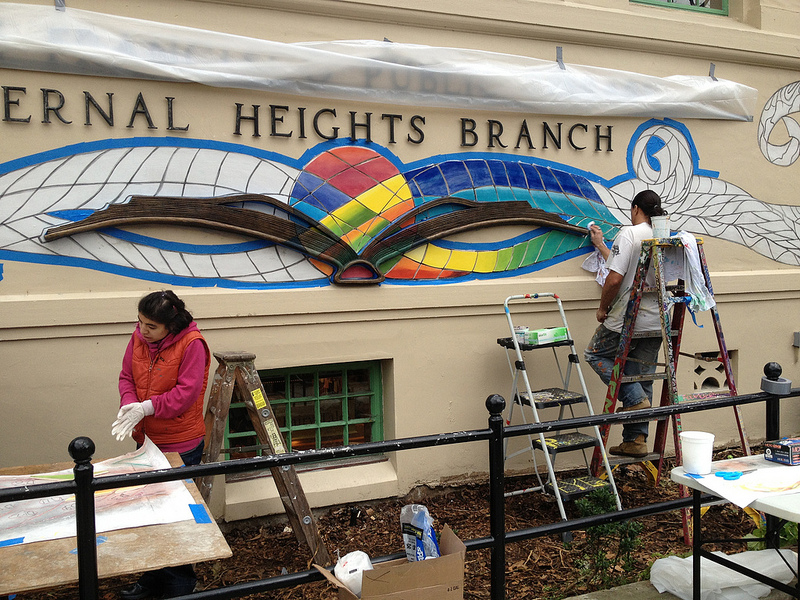

Last weekend there was a full team from Precita Eyes Murals on hand at the Bernal Heights Library to install the new artwork on the Cortland facade. What’s interesting is that — as you can see — the art is less of a mural, and more of an intricate mixed-media and tile installation. Interesting.
PHOTOS: Telstar Logistics

Primary colors? This monstrosity is like Franken-library…
My Mother always says if you have nothing nice to say, don’t say anything at all…….(crickets….)
more crickets chiming in over here, too.
I think it looks great! But, then, I would…
Thanks for the progress report, Bernalwood!
I didn’t realize it was going to be tile. Suddenly I’m more intrigued about what it will look like than the original drawings suggested.
As someone who really liked the idea of having no mural, I’m kinda excited with the direction this is taking. Whether I end up liking it or not, I am thrilled with the care and crafts(wo)manship being displayed.
Yipes, that looks seriously dreadful.
I think color is great! Long live color!
Glad to see it finally cheering up. I liked the old mural better, but this is much nicer than nothing!
It’s just so unnecessary. It cheapens the whole building. And street. Maybe it would have worked on the interior of the building – in the children’s section?
never be the same, but I love the color, and the intensions of restoring what was once there. we need color in bernal, color.
It would have been nice to have something more suited to the architecture — the building itself has (or had) an aesthetic of its own.
Love it or hate it aesthetically, I’m just happy to see the endless machinations over and the painting beginning.
As for love vs. hate, I’m in the strong “like” category. I think it’s a good homage.
Pingback: New Book About Bernal Library Mural Is Required Reading for San Francisco | Bernalwood
Pingback: Murals Proposed for Sides of Sutrito Tower Utility Building on Bernal Hill | Bernalwood